Illustrating the COVID-19 Pandemic and How the Media Hopes to Get Your Attention
In a time of global pandemonium, getting the point across is more apparent than ever. The numbers are frightening, and one would think they would stress the severity of the situation. But the reality is, most people don’t know how to understand the context of the numbers. What they understand is a strong, impactful visual. Visual art is the most universal medium to comprehend a situation.

Andrea Ucini/The Economist
The impact that art has on human comprehension far surpasses what any data can provide. Seeing the overall idea of the pandemic happening is something that can be easily processed by visual interpretation. Media around the world have taken this opportunity to highlight the COVID-19 Coronavirus pandemic by using illustrations in a powerful way.
Strong imagery provides the viewer with an immediate overall understanding of the situation at hand. People may not understand exactly what the numbers mean or how to interpret whether they are something to be worried about. Viewing art like the images below paint a clear picture through the illustration of how important the situation is.
The Economist, has recently commissioned, illustrator Andrea Ucini to interpret the global effect of this virus through strong, powerful visuals. These compelling images, bring the pandemic to light through artistic representation.

Andrea Ucini/The Economist
Panic. A word we all know and have come to experience ourselves throughout the rapid spread of this virus.
Roberto Cigna, commissioned by WebMD Magazine to create this impactful illustration of what panic actually looks like.

Roberto Cigna/WebMD

Roberto Cigna/Personal Work
Sebastien Thibault, has depicted the severity of the COVID-19 for The Walrus Magazine. He created these illustrations to show the visual of a pandemic for the cover and inside of the magazine.

Sebastien Thibault/The Walrus Magazine

Sebastien Thibault/The Walrus Magazine

Sebastien Thibault/The Walrus Magazine
The stock market has had the biggest buzz this week, with the constant rollercoaster of performance each day. Maybe you don’t understand exactly what it means when this happens. Illustrator Nien-Ken Alec Lu has created this gif as a clear interpretation of how volatile the market behaviour is and the lack of control Uncle Sam (the government) has on the economy at this time.
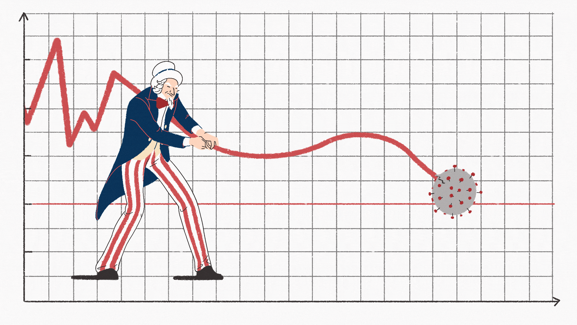
Nien-Ken Alec/Personal Piece
We rarely understand the severity of a situation at a time when an exorbitant amount of information is being put in front of us. Various channels of media have learned that the most dynamic strategy to grasp a true understanding of a pandemic is to use visual art. These images can be easily shared, easily viewed, and deeply absorbed for real impact.
Never underestimate the power of art!