Typography illustrators
Typography illustrators
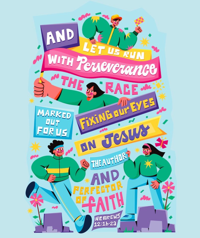
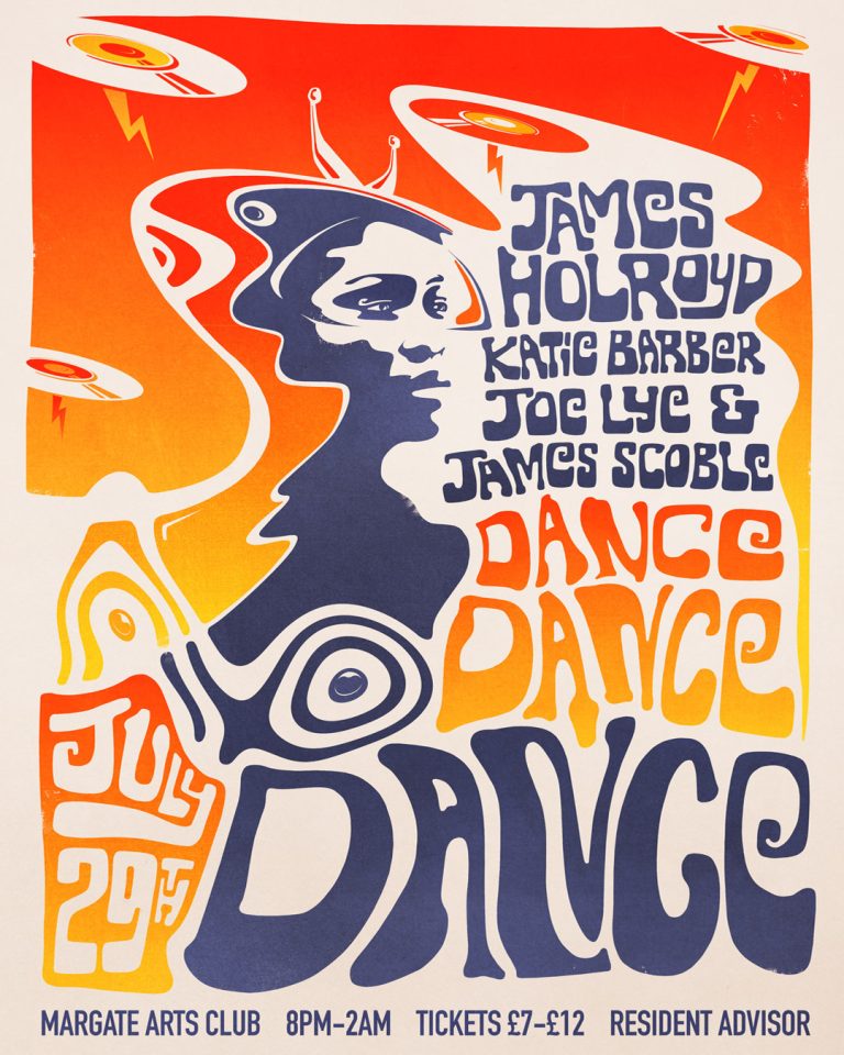
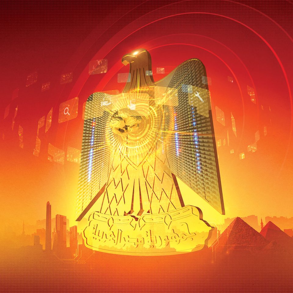
Typography illustrators arrange type on a page based upon the style and appearance of letters, numbers, and symbols to create appealing graphic design. Central to the work of every graphic designer, typography is much more than content and making words legible.
Typography illustrators consider the visual appearance of each letter and the letters that make up a word. Through the selection of a typeface, the layout of type, color choice and the skillful leading and kerning of letters, the typography illustrator can elicit a reaction to type.
Typography as art has its roots in calligraphy, movable type, and the printing press, and even farther back in early hieroglyphs that evolved into alphabets.
The early 20th century avant-garde poet, Apollinaire, created artful arrangements of type. His “ideograms” arranged lines of a poem into the shape of an object in the poem creating ballet-like movement of type on a page. These unconventional layouts made others take a second look at the expressive power of type.
An illustrator’s choice of typeface, whether serif (small decorative flourishes at the ends of some strokes that make up letters) or sans serif, is the first of many decisions the typography illustrator makes about a typographic illustration.
Leading (the vertical space between each line of type), and kerning (adjusting the space between characters), each have a subtle yet significant impact on how type is seen. Scale, and the clever use of negative space, are major players in the art of typographic illustration.
By creating elaborate, even elegant, layouts of typography, the typography illustrator brings artistry and acumen to the written word.


